Opportunity
Jenny's Tofu
Brand Identity + Packaging Design
Phoenix Bean has proudly served the Chicagoland area with fresh tofu and soy milk for over 35 years. Made with the finest organic ingredients and prepared daily, Phoenix Bean tofu and soy milk are available and sold through grocers and farmer’s markets throughout the Midwest.
Jenny and her team work closely with Illinois farmers to harvest hydroponically grown, sprouted soybeans to help conscious shoppers feel connected to local producers. Ghost Lab refreshed the brand identity system to explore ways of positioning Jenny’s Tofu in a modern light without losing its rich heritage and cultural identity.
Edwin Lee
Visual Design
Packaging Design
David Ofori-Amoah
Design Strategy
Industry // Food & Beverage
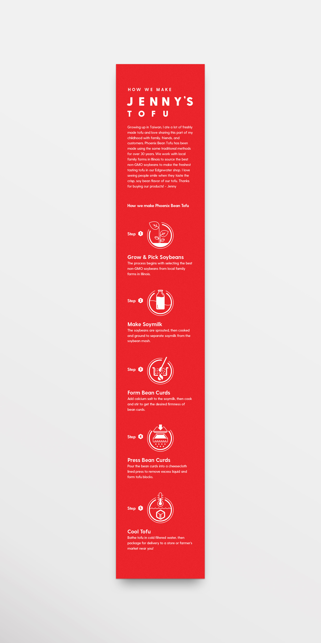
The equipment is modern, but the way we make tofu has never changed
Growing up in Taiwan, fresh tofu was never a stranger to the dinner table and an endearing part of Jenny’s childhood. What started as a dish on the dinner table flowered into a lifelong commitment and passion.
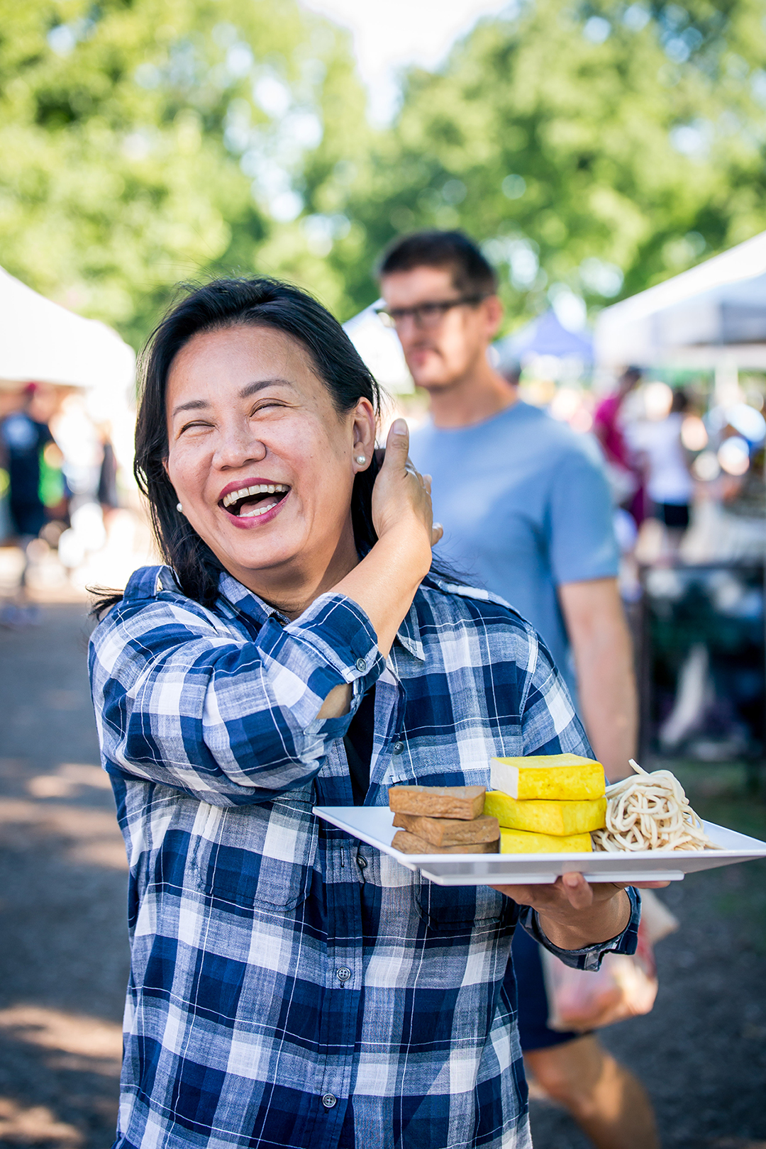
Immigrating to America, fresh tofu was hard to come by—the options at the grocery store were tasteless, gritty, and processed. Jenny quit her job to learn how to make tofu the traditional way from a renown tofu master. Traditional tofu-making methods serve as the foundation to how Jenny’s Tofu is made today. Although the equipment is modern, the way Jenny makes tofu has never changed—the tofu is made fresh every morning and the ingredients are locally-sourced.
The Ghost Lab team worked closely with Jenny to develop branding that felt modern and culturally authentic. The challenge was creating an identity that would appeal to a broader health-conscious shopper without losing sight on the Asian and farmer’s market communities that supported the business for over three decades.
In meeting with Jenny’s partners and customers, we discovered her tofu was widely referred to as, “Jenny’s Tofu.” Her reputation among Chicago’s food and restaurant community is revered—the brand equity she built is an extension of her jovial personality and passion for local, healthy food.
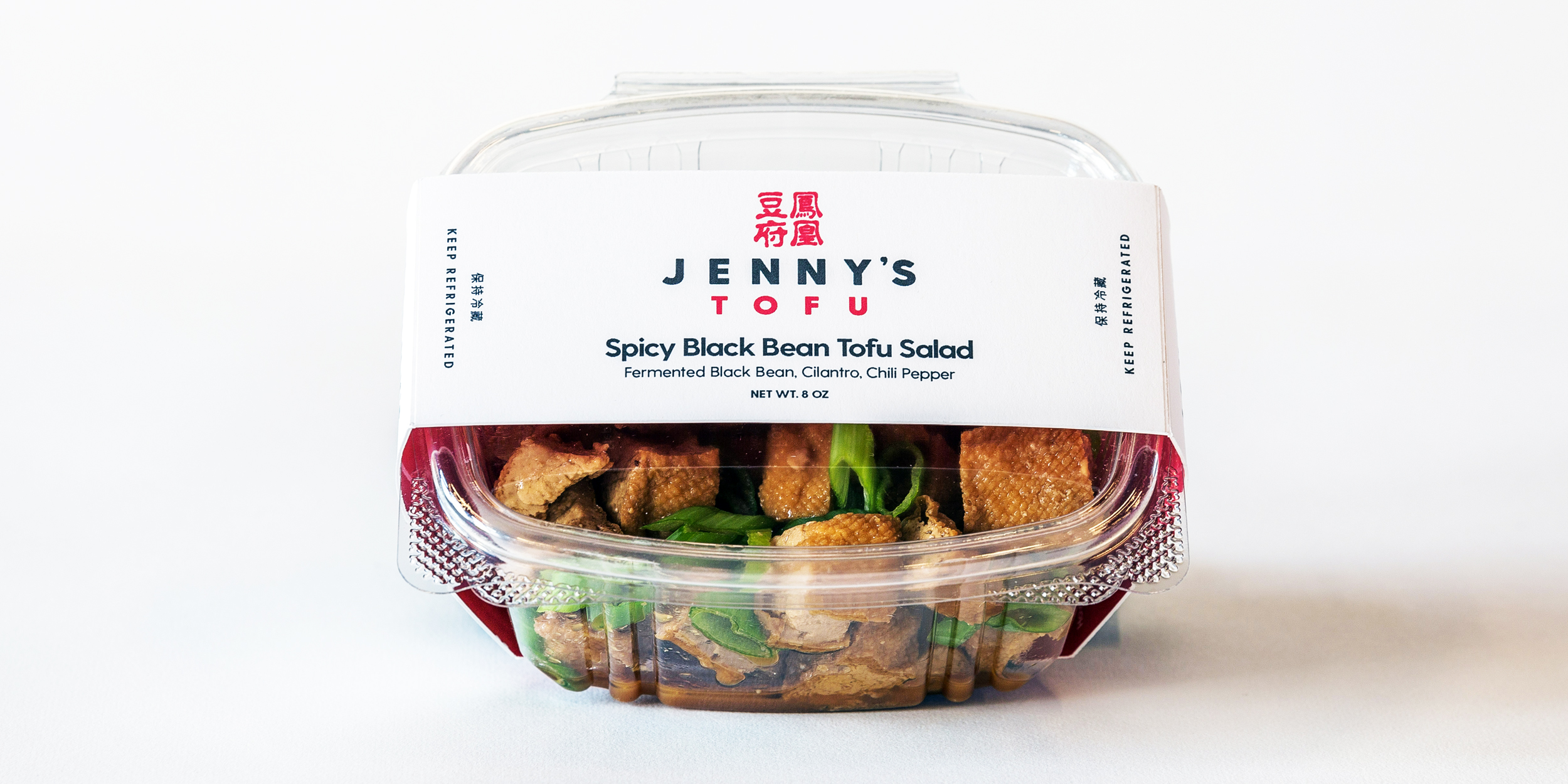
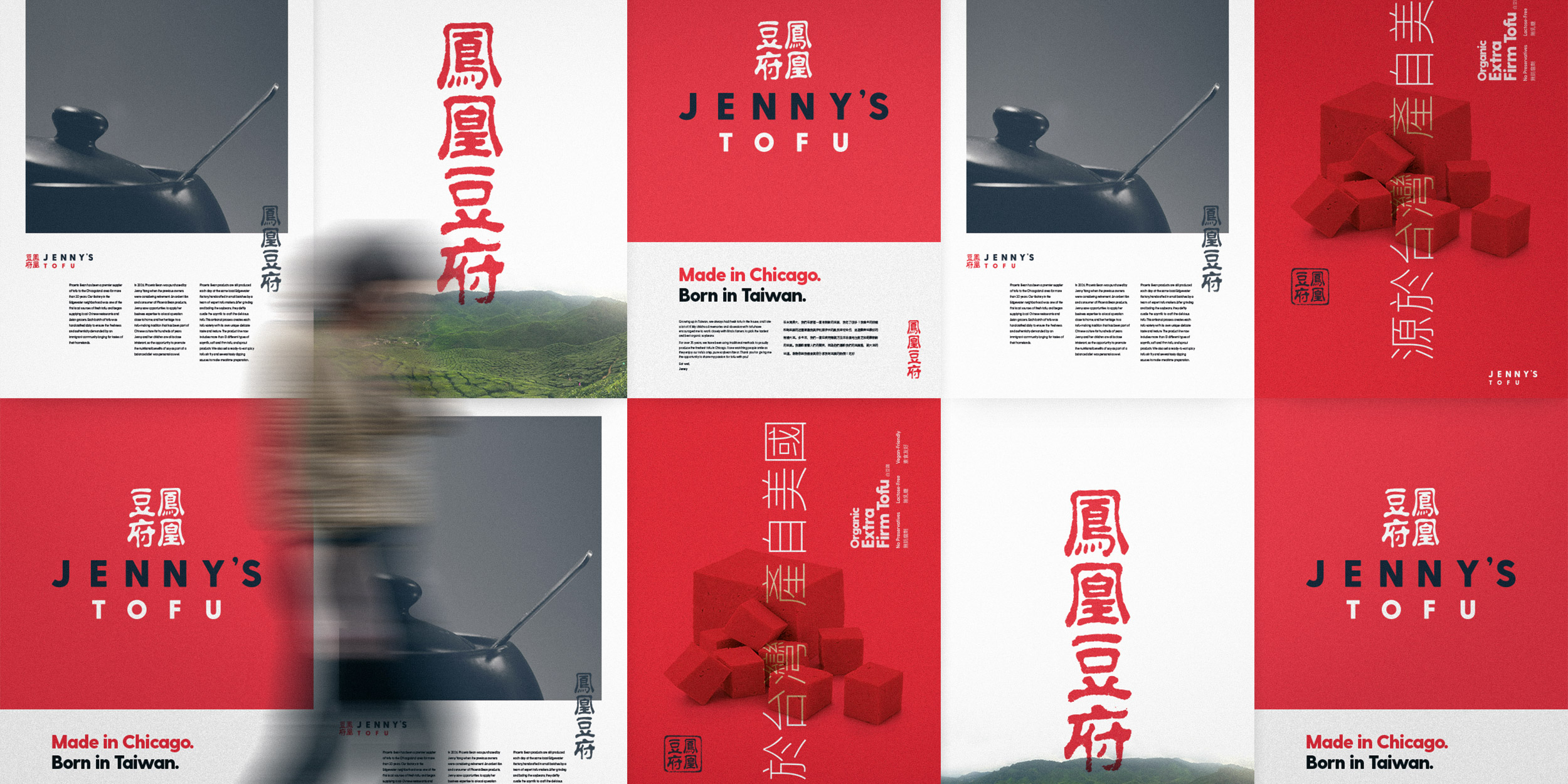
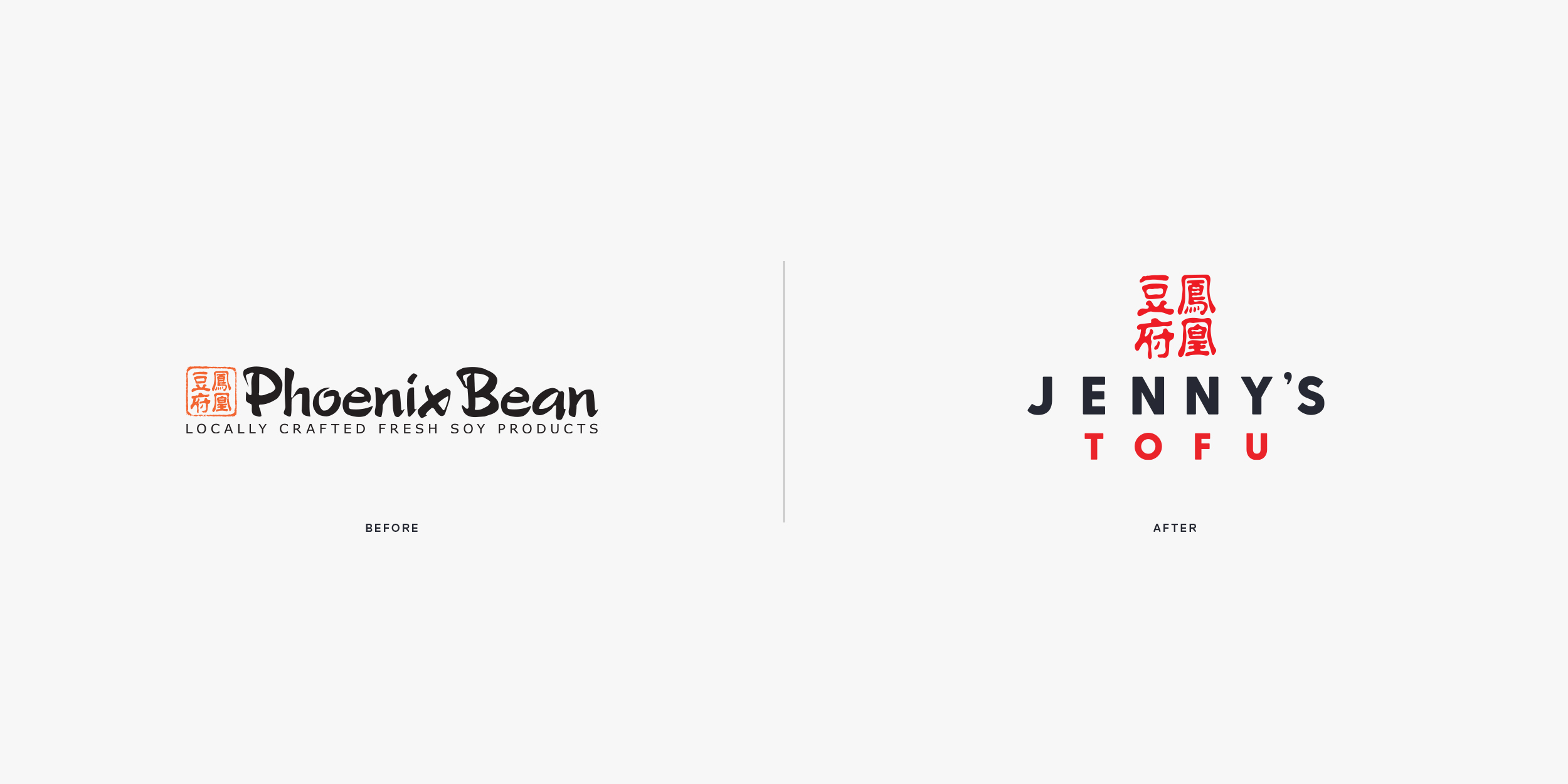
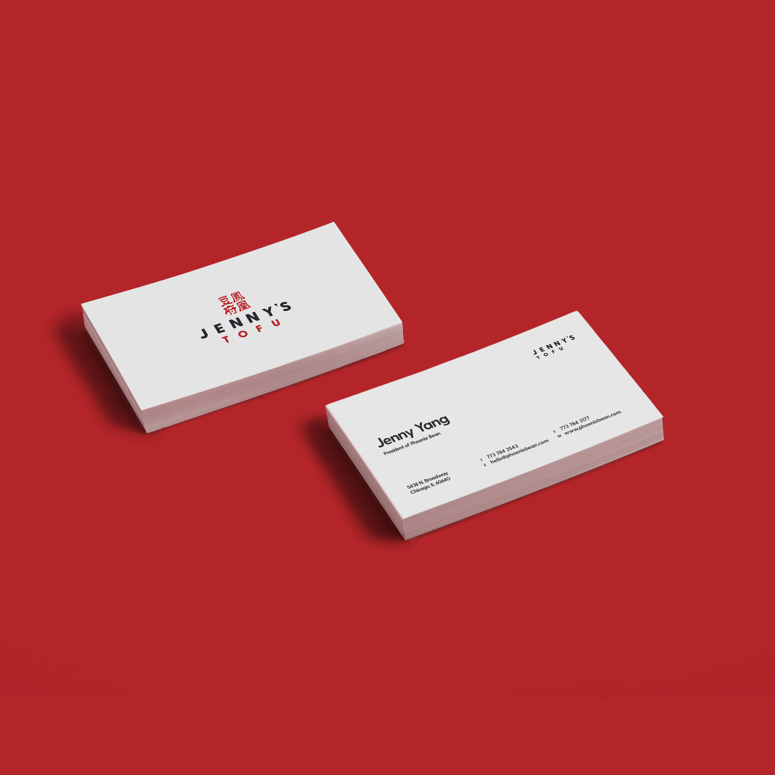
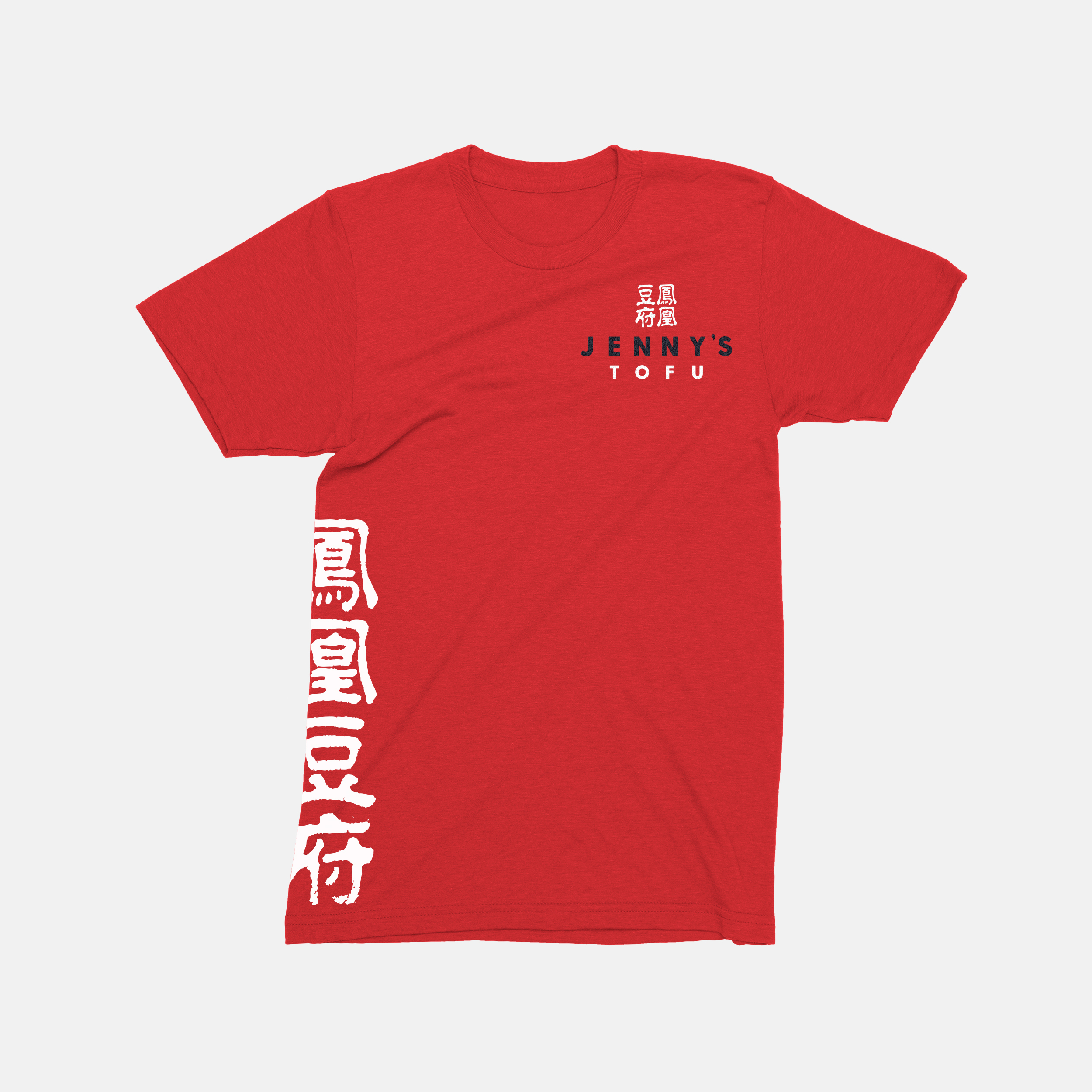
The logo adopted a modern sans serif typeface to improve legibility at small sizes and disconnect from the Asian brushstroke motif. The logotype is straight-forward and simple to focus the attention towards the Chinese chop mark—crowning the logotype and signaling he brand’s heritage. The chop was designed by a master Taiwanese calligrapher. It was slightly modified to improve readability across print and digital mediums.
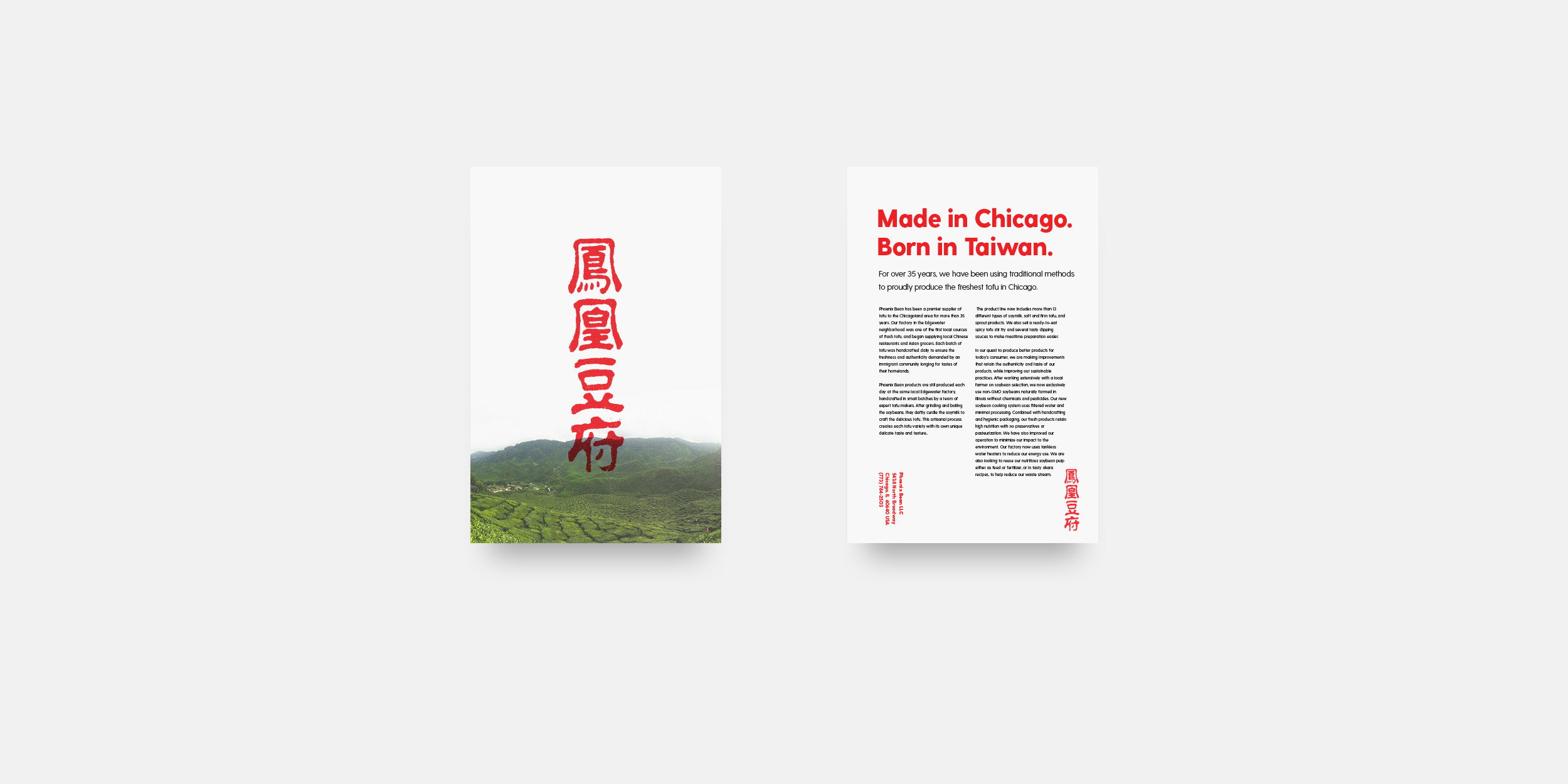
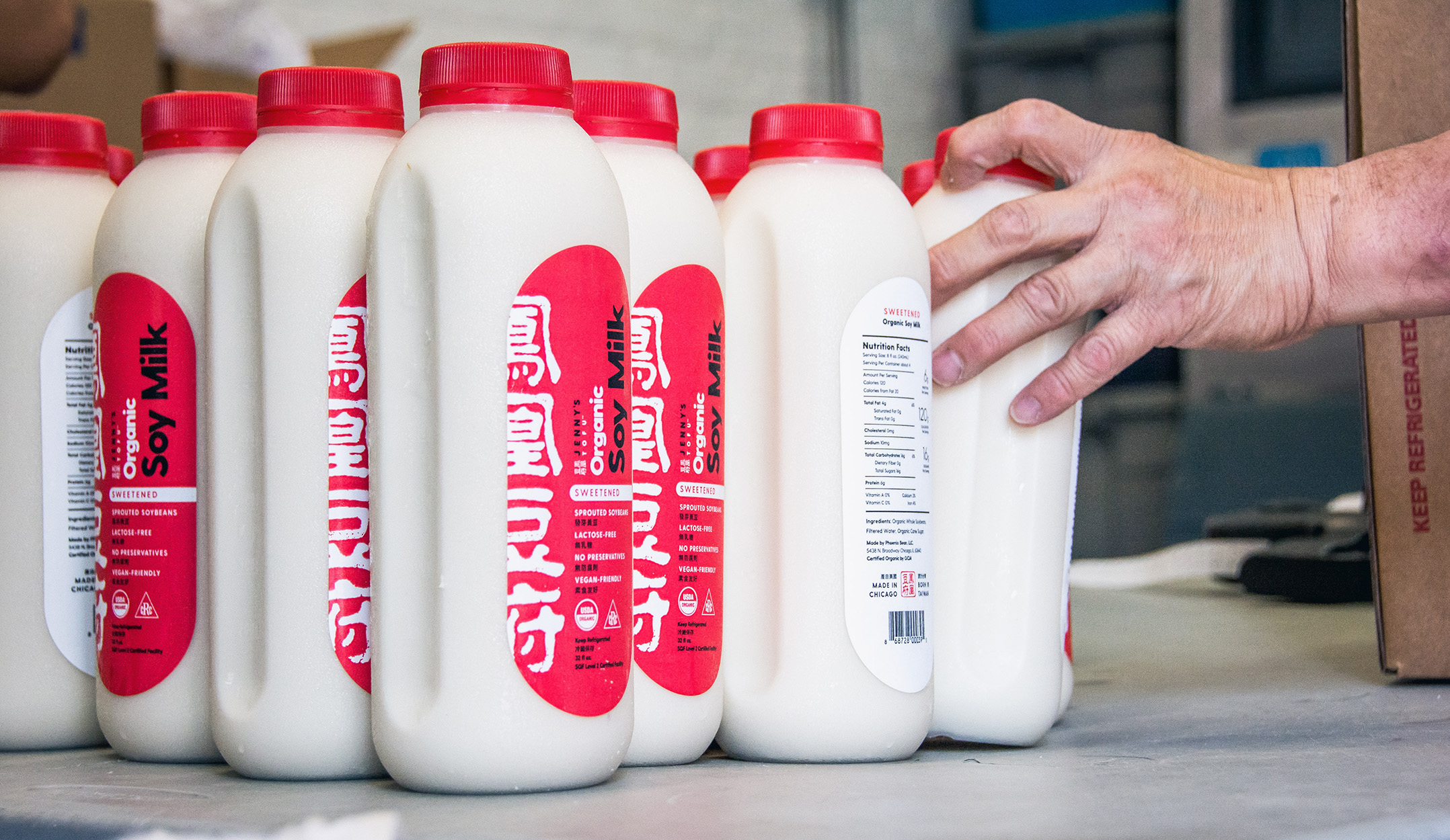
The packaging design demonstrates restraint—allowing the fresh tofu and quality ingredients to shine through the packaging. Graphic embellishments have been replaced with a clear hierarchy of information to guide the shopper’s focus across the label. Important safety guidelines are written in English and Chinese to support Jenny’s non-native English-speaking audience.
The backside of the label speaks to Jenny’s passion for tofu and guides shoppers through the tofu-making process. While visiting farmer’s markets, the team discovered many misconceptions about the health effects of consuming soy. Many shoppers, especially children were unfamiliar with how tofu was made and how to cook with it.
Jenny is passionate about food education and partners with Chicago Public Schools to share her love for locally-grown food and address the common misconceptions surrounding soy. The package design became an important touchpoint to demystify the tofu-making process and start a dialogue about the food we eat.